Brand foundations for construction visuals
Brand goals and positioning for the construction sector
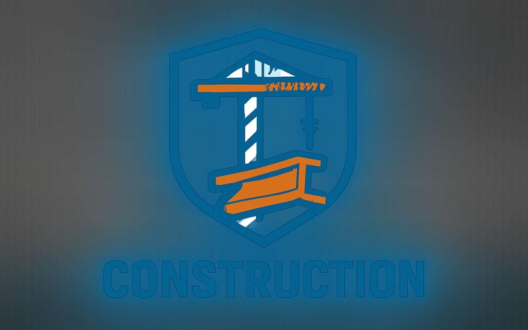
A brand is the promise you keep, painted in steel-blue and sun-warmed brick. For the construction sector, the foundation of visuals begins with the construction logo that communicates durability, trust, and regional roots. In South Africa, where projects stretch from rural heartlands to urban skylines, the visual language must feel built to last—clear lines, purposeful contrast, textures that suggest material reality.
Brand goals and positioning map to who you serve and what you stand for. The construction logo must sit at the crossroads of capability and care, signaling safety, teamwork, and reliability. To align visuals with strategy, consider these pillars:
- heritage and resilience
- precision and safety
- local partnership and community impact
When visuals echo these values, they travel from the briefing room to the job site with quiet confidence, turning ordinary scaffolding into a beacon of trustworthy workmanship.
Audience insights and buyer personas for builders and developers
As a pulse beneath a skylift, the logo you wear on tender documents becomes a memory you trust. A veteran foreman once said, “The logo is the first handshake on site.” In South Africa, audience insights show builders and developers respond to visuals that speak of longevity, craft, and local roots. Brand foundations for construction visuals hinge on knowing who buys and why, translating that clarity into typography, geometry, and color that feel practical and personal.
Audience insights spotlight three archetypes among builders and developers:
- Mid-size builders chasing speed and reliability
- Developers seeking scalable branding and predictable ROI
- Public sector buyers prioritizing local credibility and safety
Designing the construction logo to speak these languages means simplifying form for legibility on helmets, bus ads, and billboards, while layering texture hints to nod to brick, steel, and concrete—without shouting. The goal is quiet confidence that translates from tender rooms to job sites.
Competitive landscape and differentiation in construction branding
In a market where tender rooms judge by the smallest details, a well-tuned construction logo can cut through the noise in seconds. A seven-second glance can decide a bid, they say, and the right mark feels like trust you can count on. “The logo is the first handshake on site,” a veteran foreman reminded me, a sentiment that travels from South Africa’s boardrooms to quiet job sites.
Brand foundations for construction visuals translate into practical, legible identity. Ground-line grids, sturdy sans serifs, and a restrained palette evoke longevity, craft, and local roots without shouting.
- Local storytelling and credibility
- Texture cues nodding to brick, steel, concrete
- Helmet and billboard legibility at a glance
In the competitive landscape, differentiation hinges on authentic context rather than flash. A construction logo that stays consistent across tender documents, signage, and safety gear signals reliability and safety—the currencies that South African buyers value most.
Messaging architecture and value propositions for construction services
Brand foundations for construction visuals aren’t decorative; they’re a map of trust. In South Africa’s tender rooms where a single impression can tilt a bid, a well-calibrated construction logo functions like a compact contract etched in ink. “A well-crafted logo is a quiet guarantee of reliability,” a veteran estimator told me, and the point travels from boardroom to job site. Ground-line grids, sturdy sans serifs, and a restrained palette say longevity and local roots without shouting.
Messaging architecture translates that visual discipline into a clear value proposition for clients and partners; the construction logo discipline underpins that promise. Core pillars center on safety, quality, timeliness, and transparent collaboration. A consistent narrative across tender documents, signage, and uniforms reinforces credibility and reduces friction in procurement.
- Local compliance and context alignment
- Safety-first storytelling in all touchpoints
- Open channels and predictable delivery
- Craft and durability as brand hallmarks
Brand scope and touchpoints across materials and environments
In SA tender rooms, a single impression can tilt a bid—seven seconds is all it takes for a logo to register trust. A well-grounded construction logo becomes a compact contract etched in ink—steadfast, unmistakably local. Brand foundations for construction visuals map trust as precisely as a project plan, guiding how safety, quality, and timeliness are perceived before pricing enters the room.
Brand scope means every material and environment wears the same discipline. Across hard hats, site hoardings, vehicles, proposals, and digital touchpoints, the construction logo should stay legible, balanced, and restrained, radiating durability without shouting. Consider these touchpoints:
- Tender documentation and RFPs
- Site signage and hoardings
- Fleet vehicles and uniforms
- Digital presence and email templates
- PPE and safety gear
When the logo anchors these surfaces, it acts as a steady compass—local roots, predictable delivery, and a shared sense of care that resonates from the boardroom to the job site.
Design principles for construction branding
Simplicity, scalability, and durability in industrial design
Brand impressions in the built environment crystallize in about 50 milliseconds; a construction logo becomes a guidepost or a blur as steel meets scaffold. Clarity, not flourish, is the decisive currency on site—visible on helmets, banners, and signage across South Africa where trust is forged by legibility and consistency.
Design principles for construction branding hinge on three steady pillars: simplicity, scalability, durability.
- Simplicity: clear shapes and a restrained palette that read at distance and through grime.
- Scalability: a mark that remains sharp from business card to billboard.
- Durability: colorfast, high-contrast, and resistant to sun, dust, and wear.
In the South African market, this restrained visual language resonates with engineers, builders, and developers who navigate diverse environments. A well-crafted mark becomes a promise—reliable, professional, enduring—where every surface, from hard hats to project boards, carries the same quiet authority!
Typography choices for construction brands
In the built environment, impressions form in 50 milliseconds—blink and trust is either cemented or crumbling on site. For typography choices in construction branding, legibility rules, especially for a construction logo that travels from hard hats to hoardings across South Africa. A sturdy type system reads clearly from a distance and through grime, signaling reliability without shouting.
- Bold sans-serif with high x-height for quick recognition
- Generous letter spacing and clear kerning to stay legible from afar
- High-contrast color combos that survive sun and dust
For construction brands, typography choices matter as much as the mark itself, letting a well-crafted construction logo carry the mood from plan boards to project boards with quiet authority.
Color theory and palette development for field and office
“Color is the quiet handshake of trust on site,” a veteran foreman once told me, and the impact travels faster than a crane’s whistle. For design principles in construction branding, color must endure sun, dust, and grime. A well-crafted construction logo anchors identity across field and office, becoming a steady reference amid noise.
Color theory must be practical and legible at a distance on South African sites. Maintain a simple palette, ensure high contrast, and choose inks that resist fading on signage and PPE.
- High-contrast combos for legibility
- Limited palettes for brand consistency
- Durable inks and materials
The field-and-office palette duo anchors a branding strategy: field hues maximize visibility and safety, while office tones project reliability through restrained accents. The result is a brand that reads clearly, everywhere.
Iconography and metaphor in construction visuals
A single, well-placed icon can steer a crew through gale-force wind and dust. On South African sites, a construction logo must speak in bold lines and legible silhouettes from a distance, enduring sun and grime as reliably as a steel beam bears its load. “Color is the quiet handshake of trust on site,” a veteran foreman once told me, and the icon should carry that reassurance long after the crane’s whistle fades.
- Crane booms and girders that read as constructive silhouettes
- Shield or badge shapes signaling safety and accountability
- Compass-like motifs for route, site plan, and progress
- Dynamic lines that imply movement and reliability
Beyond legibility, iconography becomes metaphor: the crane lifts, the shield protects, the path directs. Distilled to a simple form, these motifs unite field and office, letting decisions flow with quiet confidence. A construction logo condenses complexity into one telling mark.
Consistency systems that power a modular brand kit
On busy South African sites, a clear construction logo acts as a workflow accelerant. A modular brand kit cuts decision fatigue on the field, letting crews spot the right message in a glance. Design principles for construction branding hinge on consistency, legibility at distance, and durability.
Consistency systems power the kit: logo lockups, typography, color, and image guidelines woven into templates for signage, proposals, and digital touchpoints. That same consistency translates to field and office!
- Logo lockups and spacing
- Typography rules and legibility
- Color palette with practical swatches
- Templates for field and office use
Visual identity elements and guidelines
Logo mark and wordmark usage guidelines
On South Africa’s bustling sites, first impressions travel faster than a diesel engine. Studies show first impressions form in under 3 seconds. A well-crafted construction logo can tilt a bid in your favor in the blink of light. Think of it as a handshake you never break—the sign your team, safety, and craft exist in a crisp symbol. It should read from a distance and survive on uniforms.
Logo mark guidelines: keep the mark dominant on primary surfaces, preserve clear space, and maintain the aspect ratio. On busy backgrounds, offer a high-contrast version or white reverse. Essentials:
- Clear space: half the mark height
- Minimum sizes: digital 24 px; print 40 mm
- Variants: full color, black, white reverse
Wordmark guidelines: use the wordform where the brand name shines; reserve lockups for communications. Keep alignment and legibility intact; never stretch. Checks:
- Consistent baseline
- Legibility in small formats
- Single color variants for contrast
CMF standards for signage, vehicles, and gear
Across South Africa’s bustling sites, first impressions sprint ahead—often formed in under three seconds. A well-crafted construction logo on signage, vehicles, and gear anchors safety, quality, and reliability in a single crisp symbol. It’s the handshake that speaks before you speak, the mark that travels with crews from site gate to boardroom and back again.
Visual identity elements and CMF standards guide how this identity survives grime, glare, and distance across signage, vehicles, and gear.
- Signage: durable materials, high-contrast color, legible typography, weather resistance.
- Vehicles: fleet livery with consistent color ramps, reflective details, robust decals that resist peeling.
- Gear: embroidered patches or prints that endure heat and rain, careful alignment, and color locking.
These choices read as a single, confident sentence on-site—every touchpoint reinforcing your brand promise.
Asset library organization and naming conventions
Across bustling South African sites, the visual identity acts as a quiet conductor. The construction logo anchors safety and promise in a single glance—an emblem that travels from gate to crane and back into the boardroom, whispering reliability even when dust and glare claim the stage. It glows with quiet certainty.
Behind this magic lies an organized asset library: a living map of your visual language. Group assets by use (signage, vehicles, gear), by file type (vector, raster), and by color system. Meticulous metadata and consistent naming keep revisions nimble and ensure cohesion across every touchpoint.
- Asset types: signage, vehicles, gear
- File formats: AI, SVG, PNG, JPG
- Color profiles: CMYK, RGB, Pantone
- Versioning and locale: v01-en
Naming conventions become a readable trail—one glance and your team knows where a file belongs, what version it is, and which market it serves.
Accessibility and legibility considerations across media
Across South African sites, a single construction logo carries more than brand equity—it can be read at 50 meters on a dusty, glare-laden day, a quiet promise that travels from gate to crane and back into the boardroom.
Visual identity elements and guidelines frame how that logo lives across signage, vehicles, and gear. Accessibility and legibility across media are not afterthoughts but the backbone of trust—contrasting backgrounds, clean typography, and consistent scale under sun or floodlight.
- High-contrast color relationships endure dust and glare on signage and screens.
- Scalable vector formats preserve crisp lines on signs, vehicles, and gear.
- Legible letterforms with generous x-height read easily from a distance.
- Descriptive alt text and consistent naming support digital accessibility.
When these elements align, the construction logo becomes a constant presence: a signal of safety, reliability, and human scale amid the noise of busy sites.
Brand guidelines: applying the system to real-world collateral
In South Africa’s sun-blasted job sites, the construction logo travels farther than the clatter of steel—the quiet signal that reads at distance amid dust and glare. Brand guidelines turn that presence into real-world power—gates, trucks, PPE—without losing its voice.
Applied across real-world collateral, the system breathes with CMF: color, material, and finish chosen for dusty winds and bright floodlights. The logo remains legible, scalable, and consistent from gate to crane. An asset library with site-relevant naming keeps designers aligned and brands intact.
- Signage that resists fading and glare with durable substrates
- Vehicle branding that stays legible at speed and angles
- PPE and gear marks that stay clear while moving through tight spaces
SEO, marketing, and implementation for construction branding
SEO-friendly logo usage: alt text, structured data, and image sitemaps
In South Africa’s crowded builder marketplace, a strong construction logo cuts through the noise. A recent client-facing study shows brands with consistent visuals are recalled up to 70% more often by procurement decision-makers.
For SEO and marketing, the logo becomes a signal that travels beyond print. Alt text that describes the image, not just the file name, helps search engines tie the logo to your site. Structured data—ImageObject metadata—clarifies height, width, and caption, while image sitemaps invite search bots to index the logo with your content.
There’s a moral weight to a logo, a promise etched in steel and light. In South Africa, when the construction logo is represented with consistency online, branding, SEO, and marketing align, shaping perception before you speak.
Portfolio and case study optimization for contractors
In South Africa’s crowded builder marketplace, a single construction logo can carve perception before a word is spoken. A client-facing study shows brands with consistent visuals are recalled up to 70% more often by procurement decision-makers, turning impressions into inquiries and bids forged in trust.
Portfolio and case study optimization hinges on narrative clarity and visual discipline. The logo should anchor every project page, aligning tone, color, and typography with outcomes, challenges, and client value. Consider these elements:
- Project narratives that tie client value to measurable outcomes
- Visual consistency across case pages, presentations, and reports
Marketing momentum follows when the construction logo travels beyond print—into quotes, social, and digital portfolios—creating a recognizable silhouette that persuades decision-makers with quiet authority. In a field where futures are built brick by brick, consistency becomes your hidden advantage.
Redesign versus refresh: timing and scope for established firms
In a market where first impressions crystallize in under seven seconds, the construction logo becomes a compass for buyers and brands alike. For established firms, a careful refresh can turbocharge SEO and credibility without eroding the trust built over years.
Marketing momentum follows when the construction logo threads through websites, proposals, and portfolios. The SEO payoff is practical: consistent visuals improve recognition, reduce bounce, and strengthen relevance across search and procurement channels.
Implementation hinges on timing and scope. For seasoned firms, a staged redesign preserves continuity while modernising perception, allowing stakeholders to align on a unified brand cadence across touchpoints.
- Phased rollout across digital and print
- Asset naming and version control
- Cross-functional governance for consistency
In the long game, the construction logo travels beyond banners into quotes and dashboards, anchoring credibility across South Africa’s competitive field with quiet authority.
Local branding impact: signage, site presence, and community
In a market where cranes cast long shadows and first impressions arrive in under seven seconds, the construction logo acts as a compass, guiding buyers and brands alike. When it mirrors signage, uniforms, and digital banners, it quietly strengthens SEO without shouting!
Marketing momentum follows as the mark threads through websites, proposals, and project boards, planting credibility in South Africa’s bustling field. Local branding gains steam when the look appears on banners, site hoardings, and community spaces, turning observers into believers.
- Signage consistency across on-site boards and vehicle liveries
- Site presence that makes the logo a familiar sight for workers and clients
- Community engagement through local events and sponsorships
Implementation leans on continuity with a slender edge of modernity, weaving the mark into print and digital assets so trust deepens rather than shifts. In the shadows of competition, the brand speaks with quiet authority, welcoming more eyes to the work.
Measuring brand performance: recognition, recall, and inquiries
Across South Africa’s crane-lit skylines, seven seconds is your window to be remembered. A construction logo, echoed on signage, site hoardings, and digital banners, quietly anchors trust and nudges SEO by delivering consistent signals to search engines and people.
Three metrics drive the scorecard: recognition, recall, and inquiries.
- Recognition: how quickly the brand registers at a glance
- Recall: the ability to name and describe the brand after exposure
- Inquiries: direct questions or requests for quotes and partnerships
Implementation weaves the construction logo into a modular system, ensuring a consistent presence across sites and collateral, so every touchpoint strengthens online visibility and trust.
